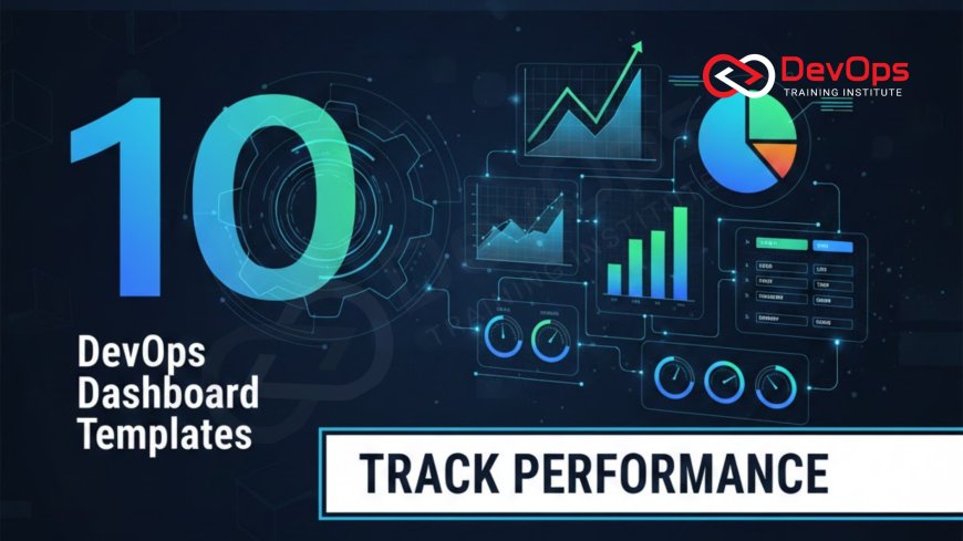
10 DevOps Dashboard Templates to Track Performance
Unlock superior operational performance and accelerated software delivery by implementing the 10 essential DevOps Dashboard templates used by high-performing engineering teams. This guide covers vital templates for tracking the four DORA metrics, application health (APM), security compliance, and cloud costs. Learn how to transform raw metrics and logs from tools like Prometheus and Grafana into clear, actionable visualizations that drive continuous improvement, shorten Mean Time to Recovery (MTTR), and ensure every team member has real-time visibility into the health and efficiency of the entire CI/CD pipeline, making data-driven decisions simple and effective.
Introduction
In the world of DevOps, where software is delivered continuously and at high velocity, visibility is paramount. Running a complex, distributed system across the cloud without clear, centralized monitoring is akin to driving a car blindfolded; eventually, a critical failure will occur without warning. A well-designed DevOps Dashboard is the engineer’s most important tool, acting as the single pane of glass that transforms massive streams of raw metrics, logs, and traces into actionable, real-time intelligence. These dashboards enable teams to proactively detect performance degradation, pinpoint the root cause of an incident in minutes, and measure the effectiveness of their delivery processes, shifting the focus from reactive firefighting to proactive, data-driven system management.
A successful monitoring strategy doesn't rely on dozens of scattered alerts; it hinges on distilling core information onto a few strategic dashboards that cater to specific audiences—from executives tracking business outcomes to engineers debugging container performance. These dashboards, often built using powerful open-source tools like Grafana and backed by data from Prometheus or cloud-native monitors, are not just visual aids; they are the feedback mechanism that drives the continuous improvement cycle. By standardizing these visualizations using proven templates, organizations can ensure that every engineering team is measuring the right things, optimizing their pipelines, and delivering maximum value to the customer reliably and efficiently, securing the operational excellence central to the DevOps methodology.
This guide presents 10 essential DevOps Dashboard templates that cover the entire software delivery lifecycle, ranging from high-level business performance down to low-level infrastructure health. Mastering these templates is the key to institutionalizing a data-driven culture and guaranteeing that the operational insights required for continuous delivery are always accessible, clear, and actionable to everyone involved in the software delivery process, moving beyond simple uptime tracking to measuring true engineering effectiveness and business alignment.
Phase 1: Measuring Delivery Efficiency (The DORA Metrics)
The four DORA (DevOps Research and Assessment) metrics are the gold standard for measuring the performance and maturity of a software delivery organization. These metrics correlate directly with both profitability and organizational performance, making them the most critical indicators for executive and leadership review. Any high-performing DevOps team prioritizes visualizing and optimizing these four data points, as they track the speed, stability, and quality of the entire pipeline, from code commit to customer value.
1. Deployment Frequency (DF) Dashboard: This template tracks how often an organization successfully releases code to production. It visualizes daily, weekly, and monthly deployment counts, broken down by team or application. A high and steady DF indicates efficient automation and a low-risk release process. This dashboard is often presented as a simple line graph and is crucial for measuring the velocity and agility of product teams, directly quantifying the speed of the software factory.
2. Lead Time for Changes (LTC) Dashboard: This critical metric measures the time it takes for code to go from the first commit to being successfully run in production. LTC is typically visualized as a histogram or trend line, broken down into component stages (e.g., development time, testing time, deployment time). A low LTC indicates high process efficiency and fast feedback loops, ensuring that new features and bug fixes reach customers quickly, driving the concept of fast flow, which is central to all modern software delivery practices.
3. Change Failure Rate (CFR) Dashboard: This template tracks the percentage of deployments to production that result in failure (e.g., service degradation, outage, required rollback). A high CFR indicates poor quality assurance or risky deployment strategies. The dashboard is typically a simple percentage displayed prominently, often trending downward, and is essential for monitoring release safety. It should ideally be correlated with the deployment frequency to ensure that speed is not compromising stability, making it the most important metric for risk mitigation.
4. Mean Time to Recover (MTTR) Dashboard: This dashboard tracks the average time it takes to restore service after a catastrophic failure or deployment-related incident. MTTR is a critical stability metric, visualizing the team's incident response maturity and system resilience. It is displayed as a time value (e.g., 15 minutes), and the goal is always to keep it as low as possible. Achieving a low MTTR requires robust automation, detailed runbooks, and high confidence in automated rollback strategies, validating the effectiveness of the team’s overall SRE principles.
Phase 2: Application and Infrastructure Health
While DORA metrics measure the *process*, application and infrastructure dashboards measure the *current state* and *health* of the deployed system. These templates are the daily interface for DevOps and SRE Engineers, providing the granular data needed to monitor service level objectives (SLOs) and immediately diagnose production problems related to performance, resource contention, and error rates in real time. They ensure that operational stability is maintained under fluctuating load and complexity.
5. Application Performance Monitoring (APM) Dashboard: This template focuses on core service-level health. It visualizes the "Golden Signals" of monitoring: Latency (request time), Traffic (requests per second), Errors (rate of 5xx and 4xx status codes), and Saturation (resource utilization like CPU and memory). The APM dashboard is vital for ensuring that user experience remains high and that service level agreements (SLAs) are met. It is often segmented by application microservice or geographical region, providing immediate insight into service performance.
6. Kubernetes Cluster Health Dashboard: Dedicated to environments running container orchestration, this dashboard visualizes the health of the Kubernetes cluster components. Key metrics include node status (available/down), Pod error rates, CPU/Memory resource requests vs. limits, persistent volume utilization, and the rate of restarts by the deployment controller. This template is essential for diagnosing resource contention, ensuring the cluster has sufficient capacity, and verifying that the fundamental infrastructure is operating efficiently, which is the cornerstone of scalable cloud-native architectures.
7. Infrastructure Resource Utilization Dashboard: This dashboard provides a high-level overview of the underlying compute, network, and storage consumption across all cloud accounts. It tracks total CPU usage, network I/O, disk throughput, and database connection pools. This template is primarily used for capacity planning and detecting anomalies or spikes in resource consumption that may indicate a runaway process, an inefficient deployment, or an imminent saturation issue. Maintaining efficient cloud utilization is also a key component of effective FinOps practices and cost control.
Phase 3: Security and Financial Governance
In a mature DevOps organization, security and financial accountability are integrated into the pipeline and tracked continuously on dedicated dashboards. These templates ensure that the engineering team is meeting compliance standards and proactively managing the substantial costs associated with running services in the cloud, linking technical deployment decisions directly to business governance and profitability metrics.
8. Security and Compliance Metrics Dashboard: This template is the core visualization for DevSecOps practices. It aggregates data from security scanning tools (SAST/DAST, vulnerability scanners like Trivy) and compliance platforms. Key metrics include the number of high-severity vulnerabilities found per application, the average time to remediate a critical vulnerability, the percentage of passing compliance checks against IaC (e.g., Terraform), and the status of deployed security agents. This dashboard proves that the organization is actively shifting left on security and embedding protection from the start.
9. FinOps and Cloud Cost Attribution Dashboard: Essential for large enterprises, this dashboard tracks cloud spending in real time, broken down by team, project, environment (Dev/Staging/Prod), and service (EC2, Lambda, RDS). It visualizes trends, highlights unexpected cost spikes, and tracks the utilization of reserved instances. This template directly supports the FinOps practice of making cloud spending transparent and encouraging engineers to be fiscally responsible with cloud resources, allowing for efficient allocation of funds and providing crucial data for budget forecasting and strategic planning.
| # | Dashboard Template | Primary Metrics Tracked | Key Audience/Purpose |
|---|---|---|---|
| 1 | Deployment Frequency (DF) | Releases per day/week, deployment counts by team. | Leadership: Measure delivery velocity and agility. |
| 2 | Lead Time for Changes (LTC) | Time from code commit to successful production run. | Engineering: Identify pipeline bottlenecks and process friction. |
| 4 | Mean Time to Recover (MTTR) | Average time to restore service after failure/incident. | SRE/Ops: Measure incident response maturity and system resilience. |
| 5 | APM (Golden Signals) | Latency, Error Rate (5xx), Traffic, Resource Saturation. | Development: Monitor application health and user experience in real time. |
| 9 | FinOps / Cloud Cost | Spending by service/team, cost anomalies, utilization of reserved instances. | Finance/Leadership: Ensure fiscal responsibility and optimize cloud spending. |
Phase 4: Operational Visibility and Executive Summary
The final template focuses on synthesizing data into a concise, high-level view that is suitable for stakeholders who need to understand the strategic health of the product without getting bogged down in granular technical details. This dashboard acts as the bridge between engineering performance and direct business impact, ensuring that technical metrics are framed within the context of customer experience and organizational goals.
10. Executive Summary and Service Health Dashboard: This high-level template combines the most critical indicators from all underlying dashboards into a single, uncluttered view. It typically features:
- Current Service Uptime (SLO tracking).
- Current Deployment Frequency (DF).
- Current Change Failure Rate (CFR).
- Total Daily Cloud Spend vs. Budget.
- Current Active Incidents (P0/P1 count).
- A high-level health map of core business services.
This template ensures that leadership has instantaneous, simplified visibility into the overall operational health and performance of the organization’s most critical software assets. It facilitates strategic decision-making and ensures transparent reporting of service reliability against the promised Service Level Objectives (SLOs), which are the crucial link between engineering performance and business accountability, as a strong focus on data is core to modern business strategy.
Implementing Dashboards with Open Source Tools
For most organizations, the standard platform for building these complex, integrated DevOps Dashboards is the open-source combination of Prometheus and Grafana. Prometheus is a time-series database and monitoring system designed to collect metrics from applications and infrastructure. Grafana then acts as the visualization layer, allowing engineers to connect to Prometheus (and other data sources like Elasticsearch or cloud monitors) and build highly customized, interactive dashboards using its intuitive drag-and-drop interface and powerful querying language.
The value of this open-source stack lies in its flexibility and wide adoption, supported by an enormous community that provides thousands of pre-built, reusable dashboard templates on platforms like the Grafana Labs Community site. Instead of building the templates above from scratch, a DevOps Engineer can typically find a community template for Kubernetes, EC2, or an application framework, import it, and customize it to their specific needs, drastically accelerating the time-to-value for the organization's observability initiative. This approach leverages shared knowledge and best practices, ensuring that monitoring systems are based on proven, community-vetted methodologies.
For engineers seeking to master this process, a foundational understanding of how Prometheus collects metrics and how to write effective PromQL (Prometheus Query Language) queries is necessary. While the visualization tool is important, the quality of the dashboard ultimately depends on the accuracy and relevance of the underlying data being collected, underscoring the importance of instrumenting applications correctly and configuring monitoring agents effectively across all virtual machines and containerized services, regardless of where they are running, and regardless of how complex the underlying networking architecture is, whether using traditional TCP/IP models or newer cloud networking techniques.
Driving Continuous Improvement Through Data
The true purpose of any DevOps Dashboard is not just to display information but to drive continuous improvement—a foundational principle of the entire DevOps methodology. Each metric is a signal pointing to a potential process inefficiency or system weakness that needs to be addressed through automation or architecture changes. For example, consistently high Lead Time for Changes (LTC) on a dashboard indicates a pipeline bottleneck, signaling the team needs to invest time in optimizing slow integration tests or streamlining manual approval gates, reducing friction in the workflow.
Similarly, a high Change Failure Rate (CFR) should trigger a review of the testing strategy, possibly necessitating the inclusion of more robust performance or integration tests in the CI stage, or perhaps the adoption of less risky deployment methods like the Blue/Green strategy. By holding weekly reviews focused entirely on the DORA metrics dashboard, teams ensure that improvement efforts are quantified, prioritized, and continuously refined, establishing a strong, data-driven culture that directly supports the core goal of accelerating the delivery of high-quality software, which is the ultimate goal of the entire software delivery pipeline, linking performance data directly to the business objectives.
Conclusion
The journey to operational excellence in DevOps is illuminated by data, and the DevOps Dashboard is the critical interface for accessing that light. By strategically implementing these 10 essential dashboard templates—covering delivery speed, service health, security compliance, and cloud financial metrics—organizations gain the transparent, real-time visibility necessary to manage the complexity of modern cloud systems. Tools like Grafana and Prometheus provide the flexible, powerful platform needed to aggregate this data from all sources.
Ultimately, a successful dashboard strategy ensures that every engineer, manager, and executive is aligned on the status and direction of the software product. This shared, actionable visibility minimizes incident impact, accelerates the detection of bottlenecks, and institutionalizes a culture of continuous improvement, proving that a data-driven approach is the most effective way to guarantee the stability and agility that the market demands from high-performing technology teams today, ensuring that the technology operates at peak efficiency.
Frequently Asked Questions
What are the four DORA metrics?
The four DORA metrics are Deployment Frequency, Lead Time for Changes, Change Failure Rate, and Mean Time to Recover (MTTR), which measure speed and stability.
What is the "Golden Signals" model for APM?
The Golden Signals model tracks Latency, Traffic, Errors, and Saturation, providing the most critical indicators of user experience and application performance and health in real time.
What is Grafana primarily used for?
Grafana is primarily used as the visualization layer, connecting to various data sources (like Prometheus) to build customizable, interactive DevOps Dashboards for monitoring and alerting.
How does the FinOps dashboard help engineers?
It helps engineers by providing transparency into cloud spending and resource utilization, encouraging them to optimize resources, use reserved instances, and clean up idle assets to control costs.
How can I find pre-built dashboard templates?
You can find pre-built templates, primarily for Grafana, on the Grafana Labs Community site, allowing you to quickly import and customize proven visualizations for common infrastructure like Kubernetes.
What metric indicates an issue with testing or quality assurance?
A high or rising Change Failure Rate (CFR) strongly indicates insufficient automated testing or a problematic deployment strategy, pointing to a quality assurance issue in the pipeline.
Why should security metrics be on a dashboard?
Security metrics should be on a dashboard to prove that the organization is actively implementing DevSecOps practices, tracking the time it takes to remediate vulnerabilities and ensuring continuous compliance.
What is the key purpose of the MTTR dashboard?
The key purpose of the MTTR dashboard is to measure and drive down the time required to restore service after an incident, demonstrating the team's efficiency and the system's resilience and recovery capabilities.
What is the underlying data source for many Grafana dashboards?
Prometheus is the most common underlying data source, as it is designed for collecting and storing time-series metrics from applications and infrastructure efficiently and reliably.
How do dashboards drive continuous improvement?
Dashboards drive improvement by providing data-driven visibility into bottlenecks (high LTC) and weaknesses (high CFR), forcing teams to prioritize automated solutions and strategic fixes.
What role does the latency metric play in APM?
Latency measures the time it takes for a request to receive a response, directly reflecting the user experience; high latency indicates a performance bottleneck in the application or network.
What is the difference between CFR and service uptime?
CFR measures deployment stability (does the *release* break the system?), while uptime measures overall service availability, tracking compliance against the defined SLA.
What kind of information does a Kubernetes cluster health dashboard show?
It typically shows node status, Pod error rates, resource utilization (CPU/Memory requests vs. limits), and persistent volume utilization to ensure cluster stability and capacity.
What audience is the Executive Summary dashboard designed for?
The Executive Summary dashboard is designed for high-level stakeholders (VPs, Directors) who need a concise, strategic overview of service health and business-aligned performance metrics.
Why is it important to learn the OSI and TCP/IP models for monitoring?
Understanding these models is vital for correctly interpreting network metrics and diagnosing where latency or errors originate within the application, network, or cloud networking stack.
What's Your Reaction?
 Like
0
 Dislike
0
 Love
0
 Funny
0
 Angry
0
 Sad
0
Sad
0
 Wow
0
Wow
0















![Kong Interview Preparation Guide [2025]](https://www.devopstraininginstitute.com/blog/uploads/images/202509/image_430x256_68dbb95326997.jpg)










![100+ Azure DevOps Interview Questions and Answers [Updated 2025]](https://www.devopstraininginstitute.com/blog/uploads/images/202509/image_140x98_68c40aa9a3834.jpg)


![90+ Git and GitHub Interview Questions [2025]](https://www.devopstraininginstitute.com/blog/uploads/images/202509/image_140x98_68c40a7931d60.jpg)


![Future Scope of DevOps Careers in Pune [Updated 2025]](https://www.devopstraininginstitute.com/blog/uploads/images/202510/image_140x98_68e3a84652312.jpg)


