


![Kong Interview Preparation Guide [2025]](https://www.devopstraininginstitute.com/blog/uploads/images/202509/image_430x256_68dbb95326997.jpg)


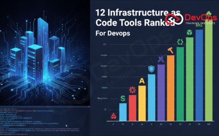
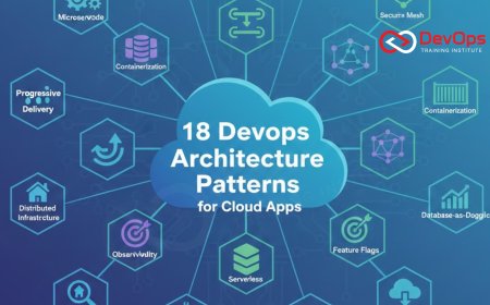
12 Tools to Visualize Infrastructure Architecture
Unlock the best twelve tools to visualize infrastructure architecture and transform your complex cloud environments into clear, actionable diagrams. This comprehensive guide explores essential technologies for 2026, ranging from automated live-mapping software to diagram-as-code frameworks that integrate directly with your CI/CD pipelines. Learn how to maintain high-quality documentation, optimize resource allocation, and enhance team collaboration across AWS, Azure, and Google Cloud. Whether you are a DevOps engineer or a system architect, these expert-recommended tools will empower you to manage your technical landscape with unprecedented precision and visual clarity in today's demanding digital world.

Introduction to Infrastructure Visualization
In the high-speed world of 2026, infrastructure is no longer a static collection of physical hardware; it is a dynamic, software-defined ecosystem that changes by the minute. As systems grow more complex with thousands of microservices and multi-cloud configurations, the ability to visualize your architecture becomes a critical necessity. Visualization tools bridge the gap between abstract code and human understanding, allowing engineers to spot bottlenecks, security gaps, and cost inefficiencies that might otherwise remain hidden in thousands of lines of configuration files.
Modern visualization is about more than just drawing pretty pictures; it is about creating a "living map" of your technical environment. These tools provide the transparency needed for effective cultural change within engineering teams, ensuring that everyone from junior developers to senior stakeholders has a shared understanding of the system. By integrating these visual assets into your daily workflows, you can improve incident handling speed and ensure that your continuous synchronization efforts lead to a stable and resilient production environment that supports long-term business growth.
The Rise of Automated Live-Mapping Tools
One of the most significant shifts in infrastructure management is the move toward automated live-mapping. Tools like Hava.io and Cloudockit connect directly to your cloud accounts—AWS, Azure, or GCP—and automatically generate diagrams based on the actual resources running in your environment. This eliminates the risk of outdated documentation and ensures that your visual representations are always accurate. By automating the discovery process, these tools save hundreds of hours of manual labor and provide a reliable baseline for compliance as code and security auditing.
Live-mapping tools are particularly valuable for identifying "shadow IT" or forgotten resources that contribute to cloud waste. They allow you to see the relationships between VPCs, subnets, and instances in real-time, making it easier to optimize your architecture patterns for both cost and performance. This proactive visibility is a cornerstone of modern reliability engineering, providing the ground-truth data needed for advanced AIOps platforms to function correctly. It ensures that your visual documentation evolves as fast as your infrastructure, providing a rock-solid foundation for system governance.
Diagram-as-Code for Developer Workflows
For teams that prefer to keep everything in their version control system, Diagram-as-Code (DaC) has become the preferred methodology. Tools like Diagrams (Python-based), PlantUML, and Mermaid allow engineers to describe their architecture using simple text-based scripts. These scripts are then rendered into high-quality diagrams automatically. This approach ensures that your diagrams are versioned, peer-reviewed, and updated alongside your infrastructure code, maintaining a perfect single source of truth across the entire software development lifecycle.
Using DaC integrates visualization directly into the CI/CD pipeline. For example, a change in your Terraform files can trigger a script that updates the corresponding architecture diagram in your documentation repository. This level of automation is essential for managing cluster states in massive Kubernetes environments where manual drawing is impossible. It empowers developers to own the documentation of the systems they build, fostering a culture of technical excellence and transparency. By treating diagrams as first-class citizens in the codebase, you ensure that visual insights are always just a git pull away.
Interactive Design Platforms for Cloud Architects
Platform-specific design tools like Cloudcraft and Brainboard offer a more interactive experience, allowing architects to visually "draw" their infrastructure and then export the corresponding code. Cloudcraft is famous for its isometric 3D AWS diagrams that include real-time cost estimates for every component. Brainboard takes this a step further by acting as a visual wrapper for Terraform, allowing you to design your cloud architecture patterns on a canvas and then automatically generate the HCL (HashiCorp Configuration Language) needed to deploy it.
These platforms are game-changers for collaborative design sessions. They allow teams to experiment with different configurations, visualize the impact on the budget, and verify security rules before a single resource is provisioned. By utilizing ChatOps techniques, these design canvases can be shared instantly across communication channels, facilitating rapid feedback from stakeholders. This synergy between visual design and automated execution represents the pinnacle of modern DevOps orchestration, providing a seamless "paved road" from architectural vision to production reality.
Top 12 Infrastructure Visualization Tools Comparison
| Tool Name | Primary Focus | Automation Level | Best For |
|---|---|---|---|
| Hava.io | Live Cloud Discovery | Fully Automated | AWS/Azure/GCP Live Sync |
| Lucidchart | General Diagramming | Manual / Partial | High-Level Stakeholder Views |
| Cloudcraft | Interactive AWS Design | Manual / Cost Sync | AWS Cost Optimization |
| Diagrams (Python) | Diagram-as-Code | Script-Driven | Developer Documentation |
| IcePanel | C4 Model Modeling | Manual / Structured | Microservices Hierarchy |
Hierarchical Modeling with the C4 Model
As systems become more modular, high-level diagrams often fail to capture the necessary detail for both developers and executives. The C4 model—Context, Containers, Components, and Code—addresses this by providing a structured way to zoom in and out of your architecture. Tools like IcePanel and Structurizr are designed specifically for this hierarchical approach, allowing you to maintain a consistent model of your system while presenting different levels of detail to different audiences. This ensures that everyone has the right context without being overwhelmed by technical noise.
Implementing hierarchical modeling is a vital step for teams managing GitOps workflows across multiple microservices. It allows you to visualize how individual service updates impact the larger system context. By using admission controllers to enforce architectural standards, you can ensure that new services fit into the defined hierarchy from the moment they are deployed. This systematic approach to visualization reduces technical debt and ensures that your architecture remains manageable and understandable as your organization scales globally.
Collaborative Whiteboarding for Brainstorming
While structured tools are great for documentation, early-stage brainstorming often requires the flexibility of a whiteboard. Miro and Excalidraw have become the industry standard for remote and hybrid teams to sketch out initial ideas for serverless architecture or complex networking flows. These tools offer a vast library of official cloud icons, allowing you to move from a rough sketch to a presentable architecture map in minutes. The real-time collaboration features ensure that everyone can contribute, breaking down the silos between development, operations, and security teams.
The beauty of these whiteboarding tools is their integration with other DevOps platforms. You can embed your Miro boards directly into Jira tickets or Confluence pages, ensuring that the architectural vision is always linked to the actual work tasks. As you move toward AI-augmented DevOps, some of these platforms are now offering AI-powered layout suggestions that can turn a messy sketch into a structured diagram automatically. This bridge between creative brainstorming and technical documentation is essential for maintaining high velocity and alignment during rapid innovation cycles in the digital age.
Checklist for Choosing Visualization Tools
- Live-Sync Capability: Does the tool connect to your cloud provider to automatically update diagrams as your infrastructure changes in real-time?
- Export Options: Can you export your diagrams to multiple formats (PNG, SVG, PDF) or, even better, as Infrastructure as Code (Terraform, CloudFormation)?
- Collaboration Features: Does it support real-time multi-user editing, commenting, and version history for remote team alignment?
- Icon Library: Does it include the latest official icons for AWS, Azure, GCP, and Kubernetes to ensure your diagrams are professionally accurate?
- API Integration: Can you trigger diagram updates from your CI/CD pipeline using a CLI or a REST API to maintain a single source of truth?
- Security and Compliance: Does the tool offer enterprise-grade security, such as SSO (Single Sign-On) and granular RBAC, to protect your architecture data?
- Learning Curve: Is the interface intuitive enough for non-experts to use, or does it require specialized training to generate usable results?
Selecting the right mix of these tools is a strategic decision that depends on your team's maturity and specific technical requirements. Many high-performing organizations use a "best-of-breed" approach, combining an automated mapping tool like Hava.io for live visibility with a Diagram-as-Code framework for developer documentation. By following this checklist, you can ensure that your visualization strategy supports your long-term technical excellence goals. It is about building a visual ecosystem that empowers your team to deliver high-quality software with confidence and speed, regardless of the complexity of the underlying cloud environment.
Conclusion on Mastering Architectural Clarity
In conclusion, the twelve tools for visualizing infrastructure architecture discussed in this guide provide a robust roadmap for any DevOps team looking to master system clarity in 2026. From the effortless precision of live-mapping to the version-controlled elegance of diagram-as-code and the collaborative power of interactive design platforms, these technologies offer a solution for every stage of the lifecycle. By turning your complex cloud environments into clear visual maps, you reduce the risk of outages, optimize your costs, and ensure that your entire organization remains aligned on the technical vision.
As you move forward, remember that who drives cultural change within your organization will be the primary factor in the success of your visualization initiatives. Technology alone is not enough; it must be supported by a culture that values documentation and transparency. Staying informed about AI augmented devops trends and modern release strategies will ensure that your visualization efforts remain a powerful asset for years to come. Ultimately, the goal is to create an invisible, self-documenting platform that allows your developers to focus on innovation while the tools handle the visual heavy lifting. Embrace these twelve pillars today to transform your infrastructure into a masterpiece of clarity and efficiency.
Frequently Asked Questions
What is infrastructure visualization in a DevOps context?
It is the practice of using tools to create visual representations of cloud resources, networks, and their relationships to improve understanding and management.
Why is automated live-mapping better than manual drawing?
Live-mapping ensures that diagrams are always accurate and up-to-date with the actual running resources, eliminating human error and outdated documentation risks.
What is Diagram-as-Code and how does it work?
Diagram-as-Code allows you to define architecture maps using text-based scripts that are automatically rendered into high-quality visual diagrams through specialized tools.
How does the C4 model improve software architecture visualization?
The C4 model provides a hierarchical structure that allows you to zoom into different levels of system detail, from context down to code.
Can I generate infrastructure code from a visual diagram?
Yes, platforms like Brainboard and Cloudcraft allow you to design visually and then export the corresponding Terraform or CloudFormation code for deployment.
Are these visualization tools secure for sensitive cloud data?
Most enterprise tools offer SSO, role-based access control, and encrypted connections to ensure your infrastructure designs remain private and secure at all times.
Does Lucidchart support automated AWS architecture discovery?
Yes, Lucidchart offers an AWS import feature that can automatically generate diagrams by scanning your AWS infrastructure through a secure cross-account role.
What is the benefit of using 3D isometric diagrams for cloud?
Tools like Cloudcraft use 3D layouts to provide a more intuitive and visually engaging way to understand complex resource relationships and costs.
Can I integrate architecture diagrams into my GitOps workflow?
Absolutely, using Diagram-as-Code tools allows you to store and version your diagrams in the same repository as your application and infrastructure code.
What role does AI play in modern architecture visualization?
AI can help by automatically organizing messy sketches, suggesting optimal resource placements, and predicting the cost impact of architectural changes in real-time.
Is there a free tool for visualizing Kubernetes clusters?
Yes, open-source tools like Lens and K9s provide visual interfaces for managing and understanding the state of your Kubernetes pods and services.
How often should I update my infrastructure diagrams?
You should aim for continuous updates; automated tools do this daily or weekly, while manual diagrams should be reviewed during every major release.
What is the "paved road" in architecture management?
The "paved road" refers to a standardized set of tools and practices that make it easy for teams to build, deploy, and document infrastructure.
Do these tools work with on-premises data centers?
Many tools, especially general diagrammers and modeling platforms, support custom icons and shapes for visualizing hybrid or purely on-premises hardware and networks.
What is the first step in starting with infrastructure visualization?
The first step is to connect an automated discovery tool to a non-production cloud account to see your current architecture mapped out instantly.
What's Your Reaction?
 Like
0
Like
0
 Dislike
0
Dislike
0
 Love
0
Love
0
 Funny
0
Funny
0
 Angry
0
Angry
0
 Sad
0
Sad
0
 Wow
0
Wow
0


![100+ Azure DevOps Interview Questions and Answers [Updated 2025]](https://www.devopstraininginstitute.com/blog/uploads/images/202509/image_140x98_68c40aa9a3834.jpg)


![Future Scope of DevOps Careers in Pune [Updated 2025]](https://www.devopstraininginstitute.com/blog/uploads/images/202510/image_140x98_68e3a84652312.jpg)