


![Kong Interview Preparation Guide [2025]](https://www.devopstraininginstitute.com/blog/uploads/images/202509/image_430x256_68dbb95326997.jpg)


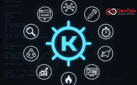
12 Kubernetes Dashboard Tools for Better Visualization
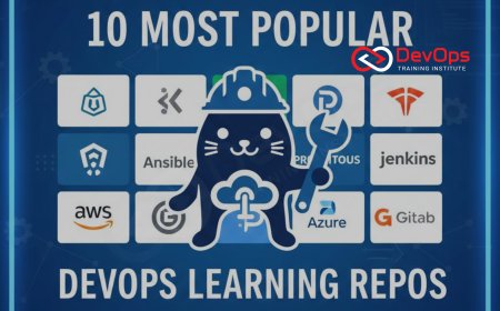
Mastering Kubernetes requires moving beyond the command line to leverage powerful visualization and dashboard tools that simplify complex resource management and monitoring. Discover the essential dashboard tools, including the official Dashboard, desktop IDEs like Lens, terminal interfaces like K9s, and observability giants like Grafana and Prometheus. This guide details how these tools provide real-time metrics, visual dependency mapping, and centralized control across multiple clusters, enabling developers and operators to debug faster, manage resources efficiently, and maintain high service stability in production environments by converting complex YAML into intuitive, actionable interfaces.
Introduction: The Visualization Necessity
The rise of Kubernetes as the global standard for container orchestration has simultaneously introduced an unparalleled level of operational complexity. While the command-line interface (CLI) tool kubectl is indispensable for advanced scripting and automation, it becomes cumbersome and inefficient for tasks requiring deep insight into cluster state, real-time resource consumption, and the complex interdependencies between services, Pods, and ConfigMaps. For a single service, kubectl is sufficient, but for managing hundreds of microservices across multiple clusters, a visual dashboard or specialized interface is no longer a luxury; it is a necessity for maintaining operational sanity and speed. Effective visualization allows engineers to quickly move from raw data to actionable intelligence, diagnosing failures in seconds rather than hours, which directly impacts business continuity and the overall velocity of the software delivery pipeline.
A high-quality Kubernetes dashboard tool serves as the "single pane of glass" for the cluster, transforming complex, multi-page YAML output into intuitive graphical representations of resource utilization, service health, and network flow. These tools are designed to democratize access to cluster management, lowering the barrier to entry for developers who may not be CLI experts, and providing operations teams with essential real-time metrics for rapid incident response. The tools fall into three main categories: official web UIs, powerful desktop applications that function as Kubernetes IDEs, and specialized observability platforms that provide deep, time-series analysis. Selecting the right tool, or combination of tools, based on team size, technical proficiency, and visualization needs is a critical architectural decision that influences daily developer productivity and cluster stability.
The twelve tools outlined in this guide represent the best-in-class solutions for understanding, managing, and visualizing the health and complexity of any Kubernetes environment, offering tailored interfaces that satisfy the demands of developers, operations engineers, and executive stakeholders alike, from powerful integrated development environments (IDEs) to specialized terminal interfaces for the most efficient power users who prefer keyboard-driven navigation over mouse clicks.
Official and Desktop IDEs
These tools prioritize user experience and comprehensive cluster management, providing a visual alternative to the native kubectl CLI. They are designed to simplify day-to-day operations, allowing users to perform common tasks like scaling Deployments, editing resources, and viewing real-time logs with intuitive mouse clicks rather than long, memorized commands. The desktop applications, in particular, offer a persistent and integrated experience that consolidates access to multiple clusters and development environments, drastically reducing the friction involved in switching between different workspaces or application contexts.
The most popular tools providing a rich graphical or command-line interface are:
Kubernetes Dashboard (Official): This is the official, general-purpose web UI for Kubernetes. It provides a foundational overview of the workloads, resource utilization (CPU/Memory at the node level), and overall cluster health. While often criticized for having limited features compared to commercial alternatives and requiring secure setup (usually via kubectl proxy), it is the most common starting point for new users due to its availability and official support. Its primary value is simplifying basic resource management tasks like scaling and viewing logs directly within the browser interface.
Lens (The Kubernetes IDE): Often dubbed the "IDE for Kubernetes," Lens is a highly popular, feature-rich desktop application that provides a powerful visual interface for managing multiple clusters simultaneously. It offers real-time metrics, customizable context-aware dashboards, and built-in features for Helm chart management and terminal access. Lens's success lies in consolidating management, monitoring, and debugging into a seamless, integrated development environment experience, making complex cluster operations highly accessible to developers and operators alike and reducing the time required to diagnose issues.
K9s (Terminal UI): For power users and those who live entirely within the command line, K9s provides a terminal-based UI (TUI) that offers real-time, interactive management of Kubernetes clusters. It expertly blends the efficiency of the command line with the intuitive visual layout of a dashboard, allowing for quick navigation, resource scaling, log streaming, and troubleshooting directly within the console window. Its efficiency and low resource footprint make it the preferred tool for experienced engineers who value speed and minimal context switching during incident response scenarios where every second counts.
Platform and Multi-Cluster Management Tools
These tools extend beyond simple visualization of a single cluster; they function as comprehensive management platforms designed to simplify the operational complexities of running multiple clusters across hybrid or multi-cloud environments. They provide centralized governance, standardized security, and streamlined application deployment workflows, addressing the critical needs of large organizations and managed service providers (MSPs) who require a unified control plane for their diverse Kubernetes deployments and consistent enforcement of enterprise policies across all clusters, regardless of their location.
Rancher: Rancher is an open-source enterprise platform that enables the management of Kubernetes clusters across virtually any infrastructure—on-premise, public cloud (AWS, Azure, GCP), or edge devices. It provides a unified, highly professional UI for deploying, managing, and securing applications in Kubernetes, offering centralized governance features, including authentication via Role-Based Access Control (RBAC) and integrated monitoring. Rancher is essential for organizations that prioritize multi-cluster stability and centralized compliance in their hybrid infrastructure, serving as the essential orchestration layer above the cloud provider's managed service.
Portainer: Primarily known as a container management platform, Portainer provides a powerful, simplified web interface that extends native support to Kubernetes. It is ideal for small to medium-sized teams and simplifies complex resource management tasks by offering application templates, simplified deployment forms, and visual resource overviews. Portainer focuses on reducing the learning curve for Kubernetes, making container orchestration and application deployment more accessible to less specialized users who prefer a straightforward graphical user interface (GUI) over lengthy YAML configurations and deep command-line interactions, thus widening the pool of capable operators.
Open Source Observability Powerhouses
Visualization is only meaningful when backed by reliable, real-time data, and these open-source tools form the industry-standard stack for collecting, storing, and presenting Kubernetes telemetry data. They specialize in time-series analysis and raw data presentation, transforming the raw metrics and usage statistics emitted by the cluster into meaningful, historical visualizations that reveal performance trends, capacity bottlenecks, and anomaly patterns over time. These tools require specialized configuration but offer unmatched customization capabilities for complex enterprise monitoring needs.
Prometheus: While technically a monitoring and alerting toolkit, Prometheus is the primary metric source for almost all open-source Kubernetes visualizations. It uses a powerful time-series database and a query language (PromQL) to collect performance data from the cluster API server, nodes, and Pods via specialized exporters (like cAdvisor). For visualization, Prometheus is typically integrated as the data source for Grafana, providing the high-fidelity backend engine that powers all the rich, dynamic charts and graphs displayed in the final dashboard layer, ensuring historical analysis is always available.
Grafana: The undisputed visualization powerhouse of the open-source world, Grafana is the front-end tool used to build rich, highly customizable dashboards from data sources like Prometheus, Elasticsearch, and various cloud monitoring services. Grafana allows engineers to correlate metrics, logs, and traces visually on a single screen, making it indispensable for rapid root cause analysis. Its flexible dashboard templating allows teams to quickly deploy standardized, context-aware dashboards for every application or cluster, ensuring consistent visibility across the engineering organization and supporting the essential SRE practice of SLO/SLI tracking.
cAdvisor: A core component built into every Kubernetes node (integrated within the Kubelet binary), cAdvisor automatically discovers and monitors resource usage and performance metrics for all containers running on that node. It provides low-level insights into CPU, memory, and network usage per container and Pod. While not a user-facing dashboard on its own, its exported metrics are the essential raw data scraped by tools like Prometheus, making it a critical, built-in visualization data source for understanding underlying resource pressure and avoiding the critical architectural mistake of ignoring resource requests and limits.
Tools Comparison Table
Selecting the ideal Kubernetes visualization tool often involves balancing the trade-offs between full-stack integration, ease of setup, open-source customization, and the overall governance required for enterprise operations. This comparison highlights the core strengths and typical use cases for five leading visualization and management tools used across the industry, addressing different needs from the desktop user to the platform administrator requiring multi-cluster management.
| Tool Name | Type / Primary Focus | Key Visualization Strength | Ideal User Scenario |
|---|---|---|---|
| Kubernetes Dashboard | Official Web UI / Management | Simplified CRUD operations and basic resource overviews. | Beginner users and basic administrative tasks via browser. |
| Lens | Desktop Application / IDE | Consolidated, context-aware metrics and logs for multi-cluster management. | Developers and power users managing multiple development clusters. |
| Prometheus | Open Source Metrics Engine | Powerful querying (PromQL) and robust alerting on historical time-series data. | SREs and Ops teams requiring specialized, metrics-focused visibility. |
| Grafana | Visualization / Dashboarding | Customizable multi-source dashboards, ideal for correlating metrics, logs, and traces. | Teams needing unified, aesthetic, and shareable operational dashboards. |
| Rancher | Enterprise Platform | Centralized governance, security, and lifecycle management for multi-cloud clusters. | Large organizations and MSPs managing hybrid/multi-cloud deployments. |
GitOps and Developer-Focused Viewers
These tools specifically cater to the modern development workflow, often embracing the GitOps model where all deployments are driven declaratively from Git. Their visualization focus is less on raw node metrics and more on the application layer: showing deployment status, tracking release history, and visualizing the health of complex application components, helping developers understand the immediate state of their delivered code within the cluster. This visual verification of the declarative state is essential for achieving continuous delivery.
Argo CD: While primarily a GitOps Continuous Delivery tool, Argo CD offers a powerful visualization dashboard that shows the live state of the application in the cluster, how it compares to the desired state in Git, and any configuration drift. Its UI is crucial for auditing deployments, managing rollbacks, and visualizing the resource dependencies of complex applications defined using Helm or Kustomize. For teams practicing true GitOps, the Argo CD UI is the definitive source of truth for deployment status and health checks, simplifying the process of managing declarative deployments.
Octant: Developed by VMware, Octant is a tool specifically designed to be a "developer-centric" Kubernetes viewer. It runs locally without requiring a dedicated server component and excels at visualizing resource dependencies and application flow, showing how services connect to Pods and volumes. Octant provides excellent, easy-to-read graphical insights into the complexities of the cluster without offering powerful write permissions, making it ideal for developers and junior operators who need to quickly inspect application topology for debugging purposes and understand how their code is wired into the cluster network.
Commercial and Full-Stack Solutions
These tools offer the ultimate in comprehensive, all-in-one observability, integrating metrics, logs, traces, and security monitoring into a single, managed platform. They are often favored by large enterprises that prioritize low operational overhead, AI-powered analysis, and guaranteed service reliability from a vendor, allowing their internal engineering teams to focus solely on product development rather than monitoring infrastructure maintenance. Their proprietary agents offer deep, code-level instrumentation that is difficult to achieve with open-source tools alone, providing complete end-to-end transaction visibility.
Sysdig: A powerful commercial cloud-native security and monitoring platform that provides deep visibility into Kubernetes. Sysdig excels at combining runtime security (threat detection) with performance monitoring, allowing teams to correlate security events (like container breakouts) directly with performance metrics. Its visualization tools offer detailed views of container activity, network flows, and compliance status across the cluster, catering heavily to the DevSecOps model and ensuring comprehensive security visibility across all virtual resources.
New Relic: A full-stack observability platform that provides extensive Kubernetes monitoring and troubleshooting capabilities. New Relic automatically collects metrics, traces, and logs, offering intuitive dashboards focused on application performance monitoring (APM) and linking container health directly to business transactions and user experience. Its strong APM capabilities and focus on distributed tracing make it ideal for visualizing the performance of complex microservices across a dynamic cloud environment, helping organizations optimize the performance critical to business revenue.
Visualizing Network and Security Health
A significant, often overlooked, aspect of Kubernetes visualization is understanding the health and security of the underlying network layer, which is essential for diagnosing communication failures and enforcing micro-segmentation. Since Kubernetes abstracts cloud networking, specialized dashboards or visualization layers are needed to reveal communication patterns that sit beneath the Pod layer and ensure that firewall policies are being respected by the CNI. For instance, diagnosing a Service failure requires knowing if the underlying network is using Layer 2 communication, even if abstracted. This means the engineer must be able to trace communication flow using logical identifiers.
For example, diagnosing why a Service cannot communicate with a Pod across different nodes requires knowing that the networking stack still relies on fundamental principles of Layer 2 communication, even if abstracted by the CNI. Tools like Cilium's Hubble provide a visual service map showing network flows and policy drops, helping engineers quickly determine if a failure is an application issue or a network policy block. This requires the engineer to be able to identify which internal virtual IP addresses correspond to which services, and how the underlying network identifies the source and destination of traffic using a low-level unique identifier system for basic connectivity checks.
Security visualization is also paramount. Dashboards focused on security allow teams to visualize Role-Based Access Control (RBAC) permissions and track external access attempts. When services are exposed, engineers must be vigilant in monitoring whether applications are communicating over secure ports and protocols, such as HTTPS/443, and ensuring that no unauthorized or unnecessary communication paths are open that could allow an attacker to exploit common ports. Furthermore, monitoring and securing communication also means understanding the transmission dynamics of various data types, requiring knowledge of the characteristics of TCP and UDP traffic. The visualization tool must empower the engineer to think holistically, reinforcing why DevOps professionals must understand the OSI and TCP/IP models to interpret complex network observability data correctly across the stack.
Conclusion
The complexity of Kubernetes is manageable only through effective visualization. The twelve dashboard and management tools outlined here—from the developer-friendly Lens and the powerful Grafana/Prometheus stack to the enterprise control provided by Rancher and Sysdig—offer essential pathways for teams to gain the necessary clarity and control over their clusters. These tools transform complex YAML configurations and ephemeral resource states into intuitive, actionable intelligence, drastically reducing the time spent on troubleshooting and increasing operational confidence for every user in the organization, whether they are a core platform engineer or a product developer.
The optimal visualization strategy involves combining the deep data analysis of observability tools (metrics/logs) with the ease of management provided by a desktop IDE or a platform like Rancher. By leveraging these visual aids, organizations lower the barrier to entry, maximize developer efficiency, and ensure that their Kubernetes clusters remain stable, secure, and easily auditable, securing their investment in cloud-native container orchestration for the long term and allowing for high-velocity software delivery.
Frequently Asked Questions
What is the difference between Lens and the Kubernetes Dashboard?
Lens is a powerful, integrated desktop application for multi-cluster management, whereas the Kubernetes Dashboard is a basic, single-cluster web UI.
Why is Prometheus the standard for Kubernetes monitoring?
Prometheus is the standard because it is CNCF-native and perfectly designed for collecting time-series metrics from ephemeral, distributed containerized environments.
How does K9s simplify management for power users?
K9s provides a live, interactive terminal UI (TUI) that blends the speed of the command line with the visual context of a graphical dashboard for efficiency.
What is the main benefit of using Rancher?
The main benefit of Rancher is centralized governance and simplified lifecycle management for multi-cluster, hybrid, and multi-cloud Kubernetes deployments.
How does Argo CD aid visualization?
Argo CD visualizes the live state of the application, comparing it to the desired state in Git, and showing resource dependency maps for clear auditing.
Why is cAdvisor important for visualization data?
cAdvisor is the built-in component that automatically collects low-level resource usage per container, providing the raw data source for tools like Prometheus.
What role does Grafana play in the observability stack?
Grafana is the visualization layer, used to create custom dashboards that correlate metrics, logs, and traces from multiple disparate data sources.
How do commercial tools like Sysdig integrate security?
Tools like Sysdig combine monitoring with runtime security, allowing teams to visually correlate performance metrics with security events and compliance status.
How can I securely access the Kubernetes Dashboard?
Access should be secured using kubectl proxy or an Ingress Controller, ensuring strict RBAC authentication for all users accessing the control plane.
What is Octant's primary focus?
Octant is focused on being a developer-centric, read-only viewer that runs locally, excelling at visualizing resource dependencies and application flow for debugging.
What is the key advantage of using a desktop IDE like Lens?
The key advantage is consolidating access and management for multiple different Kubernetes clusters into a single, persistent, feature-rich application environment.
Why is visualizing network security policies essential?
It is essential for ensuring that NetworkPolicy objects are correctly segmenting Pod traffic, preventing lateral movement, and reducing the cluster's overall attack surface.
How do monitoring tools use TCP and UDP traffic knowledge?
Monitoring tools must correctly interpret TCP and UDP traffic to diagnose whether communication failures are due to connection loss or simply non-guaranteed delivery protocols.
What visualization benefit does Portainer provide?
Portainer provides a simplified, template-driven GUI for container management, lowering the barrier to entry for users performing scaling and resource updates in Kubernetes.
How do visualization tools help avoid cost overruns?
They provide clear, real-time dashboards of CPU/memory utilization, helping teams spot over-provisioned resources and allowing for necessary rightsizing recommendations.
What's Your Reaction?
 Like
0
Like
0
 Dislike
0
Dislike
0
 Love
0
Love
0
 Funny
0
Funny
0
 Angry
0
Angry
0
 Sad
0
Sad
0
 Wow
0
Wow
0
![100+ Azure DevOps Interview Questions and Answers [Updated 2025]](https://www.devopstraininginstitute.com/blog/uploads/images/202509/image_140x98_68c40aa9a3834.jpg)


![Future Scope of DevOps Careers in Pune [Updated 2025]](https://www.devopstraininginstitute.com/blog/uploads/images/202510/image_140x98_68e3a84652312.jpg)