


![Kong Interview Preparation Guide [2025]](https://www.devopstraininginstitute.com/blog/uploads/images/202509/image_430x256_68dbb95326997.jpg)


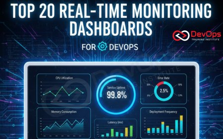
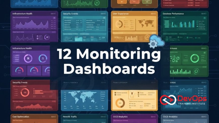
12 Monitoring Dashboards Every DevOps Should Build
Elevate your operational efficiency and service reliability with 12 essential monitoring dashboards every DevOps and SRE professional needs in their toolkit. This guide focuses on building actionable dashboards using industry-standard tools like Prometheus and Grafana, covering the entire software delivery lifecycle—from foundational Golden Signals (RED/USE) for application health to critical insights into CI/CD pipeline performance, Kubernetes cluster health, and database performance. Learn the key metrics, visualization techniques, and best practices for creating dashboards that go beyond simple data display, focusing on reducing Mean Time to Detection (MTTD) and optimizing Mean Time to Recovery (MTTR). We cover critical infrastructure topics including advanced log management, efficient file system management metrics, and auditing with user management insights, ensuring you can visualize and maintain both the application stack and its underlying hosts securely and efficiently.
Introduction: Dashboards as the Operational Command Center
In the world of DevOps, visibility is paramount. A well-constructed monitoring dashboard transforms raw metrics, logs, and traces into actionable insights, dramatically reducing the time it takes to detect and diagnose a problem (MTTD). Building these visual interfaces is not just about dumping data onto a screen; it's about curating a narrative that instantly tells the story of your system's health. For professionals utilizing tools like Prometheus for metric collection and Grafana for visualization, the challenge is selecting the right metrics to focus on. The 12 dashboards below are organized to cover the four key areas of any modern distributed system: Application Performance, Infrastructure Health, Delivery Pipeline Efficiency, and Security/Compliance. Mastering these dashboards means moving from reactive firefighting to proactive, data-driven system management.
1. The Application Golden Signals Dashboard (RED Method)
The Application Golden Signals Dashboard serves as the single most important view for determining the health of any user-facing service, acting as the first point of reference during any incident investigation. This dashboard is built around the SRE-mandated RED method: Rate, Errors, and Duration. Rate tracks the total volume of requests or transactions handled by the service per unit of time, giving an immediate understanding of current traffic load. Errors monitors the percentage or count of requests that fail, typically tracking 5xx HTTP response codes or application exceptions, providing a direct measure of reliability. Duration tracks the latency, focusing on high percentiles (p95 and p99) to capture the worst-case experience for the vast majority of users, which is far more actionable than simple average latency, thereby moving the focus squarely onto user happiness. By displaying these three metrics prominently in high-contrast gauges and large time-series graphs, the dashboard ensures that operational teams can immediately determine the scope and severity of an issue without needing to drill down into complex infrastructure metrics. This approach keeps the focus strictly on the output of the system as perceived by the end-user, ensuring engineering priorities are always aligned with business reliability goals.
Visualization for the Golden Signals must prioritize immediacy and clarity. For Rate and Errors, prominent single-stat panels showing current values and a comparison against historical trends (e.g., the last 24 hours) are highly effective for spotting anomalies. The most critical panel is the latency graph, which should explicitly plot the p95 and p99 duration lines over time. This visualization ensures that slow transactions impacting only 1% or 5% of users are not masked by fast average response times, which is a common pitfall in less mature monitoring setups. Furthermore, it is beneficial to segment the Golden Signals by critical endpoints, such as login API, checkout process, or core search functionality, as a dip in reliability on one service segment might be hidden by the overall system average. A dedicated panel or section for each critical workflow allows for targeted alerting and faster diagnosis when an error occurs, providing granular control over service health measurement. This dashboard is non-negotiable for any team practicing SRE or robust DevOps.
The dashboard should also incorporate the Service Level Objective (SLO) directly into its visualization. If the SLO for latency is a p95 of less than 200ms, the latency graph should have a visible reference line at 200ms, allowing operators to instantly see when the service violates its reliability contract. This integration turns the dashboard from a mere status display into a governance tool. The final key element of this dashboard is its drill-down capability. While the high-level view provides the "what" (the latency spiked), every panel should be clickable, linking directly to lower-level dashboards that explain the "why," such as the Infrastructure Health Dashboard or the Database Performance Dashboard. This ensures a seamless workflow from detection to diagnosis, significantly shaving crucial minutes off the Mean Time to Recovery (MTTR). By keeping the Golden Signals visible on a shared screen, the entire development and operations team remains aligned on the single most important measure of success: a reliable and fast user experience, thereby reinforcing shared ownership and responsibility across the value stream.
2. The Core Infrastructure Health Dashboard (USE Method)
The Infrastructure Health Dashboard uses the USE method (Utilization, Saturation, Errors) to identify resource bottlenecks and physical host problems across the entire compute fleet, ensuring the stability of the foundation beneath the applications.
- Utilization: This monitors how much of a resource is currently busy. Key metrics include CPU utilization, memory usage, and network interface utilization. Tracking this ensures resources aren't unnecessarily idle (waste) or nearing maximum capacity, which necessitates preemptive scaling.
- Saturation: This is the most critical metric for performance and resilience, measuring the amount of work waiting for a resource that cannot be immediately serviced. Key metrics are CPU load average (workload queue depth), pending I/O requests, and memory swapping frequency, all of which indicate an imminent bottleneck and performance degradation.
- Errors: This tracks explicit resource failures. Examples include disk I/O errors, network packet drops, and kernel error counts. Monitoring errors ensures that silent hardware degradation or faulty network components are immediately flagged for maintenance, preventing unexpected crashes.
- Memory Usage Breakdown: Go beyond total memory usage by graphing the breakdown of memory into cache, buffers, and active/inactive usage. This level of detail helps distinguish between expected OS caching behavior and actual memory pressure that could lead to thrashing and performance collapse.
- Disk I/O and Throughput: Monitor read/write throughput (bytes per second) and, more importantly, I/O wait time and latency. High latency indicates a storage bottleneck, often pointing to an issue in the underlying hypervisor, cloud storage service, or a misconfigured volume.
- Network Interface Errors: Track input and output errors, packet drops, and collisions on all active network interfaces. Spikes in these metrics often precede service connection issues and can indicate faulty virtual machine drivers or network switch problems within the infrastructure layer.
- High-Contrast Status: Use status maps or high-contrast color coding to show the aggregate health of all hosts at a glance, allowing operators to quickly identify which specific host has crossed a critical threshold for saturation or errors among potentially hundreds of machines.
3. CI/CD Pipeline Performance Dashboard
The CI/CD Pipeline Performance Dashboard is foundational for measuring the effectiveness and efficiency of the engineering organization, providing visibility into the agility and stability of the entire software delivery process. Its metrics are derived from the industry-standard DORA metrics (Deployment Frequency, Lead Time for Changes, Change Failure Rate, and Mean Time to Recovery). Deployment Frequency is a measure of agility, tracking how often code is successfully released to production. A high, consistent frequency indicates small, low-risk changes are being shipped quickly. Lead Time for Changes is arguably the most important metric, measuring the total time elapsed from when a developer commits code until that code is running successfully in production, encapsulating the efficiency of the entire development and deployment pipeline. A long lead time points to bottlenecks in testing, review, or deployment stages that need optimization. This dashboard should act as a constant feedback loop, turning organizational goals for agility into objective, measurable numbers that drive conversations and project prioritization within the engineering team, ensuring continuous improvement is not just a philosophy but a quantifiable process tracked over time.
To be actionable, the dashboard must clearly distinguish between technical failure and process inefficiency. The Change Failure Rate (CFR) tracks the percentage of changes released to production that subsequently result in a service impairment or require immediate remediation, serving as a measure of deployment quality and test coverage effectiveness. Conversely, Mean Time to Recovery (MTTR) measures the speed of response, tracking the average time it takes to restore service after a failure occurs, encompassing detection, diagnosis, and repair, thereby quantifying organizational resilience. Visualization for these metrics should focus on trend lines and historical comparisons. For example, a rolling 90-day chart showing MTTR trends can prove that recent investments in automated testing and better runbooks are genuinely improving operational responsiveness. Filtering capabilities are also essential, allowing the team to view metrics sliced by individual service, team, or repository, which helps pinpoint specific areas of the organization that are struggling with quality or speed. This granular view enables targeted coaching and resource allocation to address specific bottlenecks, making the data highly tactical and reducing wasted effort on solving generalized "pipeline issues."
A crucial, non-DORA addition to this dashboard is the tracking of pipeline stage duration. By measuring the time spent in each stage (e.g., unit test duration, security scan time, deployment step time), teams can pinpoint the specific automated process causing latency. For instance, if the automated security scan suddenly doubles its runtime, it will be immediately visible on this dashboard, allowing the infrastructure team to investigate the bottleneck before it significantly impacts the overall Lead Time. This dashboard also serves as a strong signal for DevSecOps maturity: tracking the number of security vulnerabilities found and automatically fixed within the CI stage, versus those that reach the final deployment stage, proves the effectiveness of shifting security left in the delivery process. Ultimately, the CI/CD Pipeline Performance Dashboard provides the organizational data necessary to bridge the gap between business objectives (deliver features faster) and technical execution (optimize the pipeline), ensuring that speed is not sacrificed for stability but is built on a foundation of measurable, efficient automation.
4. Kubernetes Control Plane Stability Dashboard
This dashboard monitors the non-application-specific components of the Kubernetes cluster, ensuring the orchestrator itself is functioning correctly and reliably scheduling workloads. Control plane health is foundational for application stability.
- etcd Health and Latency: Etcd is the distributed key-value store that holds the cluster state. The dashboard must track etcd write latency (p99) and leader election frequency. High latency or frequent leader changes indicate fundamental instability, potentially leading to cascading failures.
- API Server Request Duration: Track the p95 and p99 latency of API requests broken down by HTTP method (GET, POST, PUT). High POST/PUT latency suggests bottlenecks when applying changes or scaling, while high GET latency indicates problems accessing the cluster state.
- Scheduler Queue Depth and Failures: Monitor the number of Pods currently waiting in the scheduling queue. A growing queue depth indicates the scheduler cannot keep pace with new workload requests, preventing applications from starting quickly. Failures in scheduling attempts should also be tracked.
- Controller Manager Status: Track the health checks for critical internal controllers (e.g., node controller, endpoint controller). Any controller reporting a failure or degraded state must be flagged immediately, as this compromises Kubernetes' ability to maintain the desired state.
- Certificate Expiration: A non-metric but critical operational item: display the remaining validity period for the cluster's internal TLS certificates. Certificate expiration is a common cause of complete cluster failure, and this dashboard provides essential preemptive warning.
- High-Availability Check: For multi-master setups, visualize the status (leader/follower) and network connectivity between the control plane nodes, ensuring quorum is maintained and communication links are healthy.
- Admission Webhook Performance: If using dynamic admission controllers (for security/policy enforcement), track their latency and failure rate. A slow or failing webhook can prevent all resource creation or modification in the cluster.
5. Kubernetes Worker Node Resource Dashboard
This dashboard focuses on the health and capacity of the worker nodes, which are the hosts that actually run the application containers, making resource planning visible.
Node Utilization and Saturation
Track the overall CPU and Memory utilization across the entire worker node pool. This is essential for preemptive cluster scaling, ensuring that the team adds new nodes before existing ones reach high saturation levels.
Visualize the load average across all nodes, focusing on p95 saturation levels. This helps identify resource contention that could starve Pods and degrade application performance across multiple deployments simultaneously.
Allocatable vs. Requested Capacity
Compare the total resources allocatable by the scheduler against the total resources requested by the deployed Pods. This ratio shows how close the cluster is to reaching capacity based on reserved resources, even if actual usage is low.
A high requested-to-allocatable ratio triggers a warning for capacity planning. This is the primary metric used to prevent scheduling failures and ensures new workloads can be deployed instantly when required.
Storage and Kubelet Status
Monitor disk space utilization on the worker nodes, focusing on the volumes used by Docker/Containerd for image storage. Sudden consumption spikes can lead to node unresponsiveness and Pod eviction.
The dashboard should display the Kubelet health and readiness status for every single node. A node that goes to "NotReady" status should trigger the most severe alert, as all Pods on that node are immediately compromised.
6. Critical Database Performance Dashboard
The database is often the single most critical component of an application stack, making its dedicated monitoring dashboard vital for business continuity and performance assurance. This dashboard must focus on metrics that directly impact application response time and data integrity. Query Latency is the cornerstone metric, tracked not just as an average, but as high percentiles (p95, p99) to capture the experience of users hit by the slowest queries. Tracking p99 query latency helps isolate problematic queries that might only run during peak times or complex reporting cycles. Next, monitoring Active Connections is essential for capacity planning. A spike in active connections nearing the configured limit can lead to connection throttling or outright refusal, causing cascading errors across the application layer. The connection pool status and the rate of connection pool exhaustion should be directly visible. Finally, Cache Hit Ratio (e.g., InnoDB buffer pool hit ratio in MySQL or cache hit rate in Redis) is an important proxy for performance efficiency; a falling hit ratio means the database is relying more heavily on slower disk I/O, indicating a need for memory optimization or query refactoring to prevent unnecessary disk access.
For distributed or clustered database systems, the dashboard must prioritize metrics related to data consistency and high availability. Replication Lag—the time difference between data written to the primary node and that data appearing on a replica node—must be displayed prominently, often with a large, color-coded gauge. Lag is a critical warning sign for potential data loss during failover and impacts services that rely on read-after-write consistency from replica nodes. Any non-zero replication lag should be immediately visible. Furthermore, tracking Deadlocks and the rate of Lock Contention helps isolate application-level code issues where simultaneous transactions are blocking each other, leading to service slowdowns and timeouts. These metrics require specific instrumentation, often through database exporter tools (e.g., Prometheus database exporters) that expose internal state variables. The visualization should clearly separate read traffic metrics from write traffic metrics, as performance issues often manifest differently in read-heavy versus write-heavy workloads, enabling rapid diagnosis of the affected application component.
An often-overlooked but highly useful component of the database dashboard is the visualization of Slow Query Logs or execution plan summaries. While the monitoring dashboard itself cannot fix the slow query, it should list the top 10 slowest queries by execution time or frequency over the last hour. This highly actionable data directs developer time toward the most significant performance bottlenecks, optimizing resource usage at the application layer. Another crucial metric is the Rate of Transactions broken down by success and failure. Tracking failed transactions helps pinpoint database constraint violations or cascading rollbacks caused by application bugs. The dashboard acts as a bridge between the DevOps team (monitoring latency and connections) and the development team (refining queries and transaction logic). By providing objective, real-time data on the database's internal performance, this dashboard ensures the most expensive and critical application component is always operating within safe limits and that any performance degradation is swiftly traced back to the specific query or lock causing the issue.
7. Application Error and Log Management Dashboard
This dashboard centralizes visibility into log streams, transforming raw log data into structured metrics to monitor application-level error rates and log volume anomalies.
- Error/Warning/Fatal Counts: Track the total number of errors, warnings, and fatal messages generated by the application over time. This metric provides a crucial early warning system for application-level instability, often spiking before latency metrics show degradation.
- Total Log Volume: Monitor the rate of log ingestion (logs per second) broken down by application service. Sudden drops or spikes in volume can indicate that a service has crashed, is looping out of control, or is suffering a silent failure.
- HTTP Status Code Distribution: Visualize the percentage breakdown of HTTP status codes (2xx, 4xx, 5xx). A rising 5xx rate points to internal server errors, while a rising 4xx rate indicates client-side errors or authentication problems, allowing for targeted alerting.
- Top Error Messages and Sources: Use a table to display the top 10 most frequent error messages and the specific service instances (Pods/VMs) generating them. This immediately directs engineers to the failing component during diagnosis.
- Latency from Logs: Use log parsing to extract and graph transaction latency embedded within log lines, providing an alternative latency view that is highly accurate for services that don't export standard metrics.
- Structured Data Consistency: Monitor the success rate of log parsing. If a high volume of logs fail to parse into the desired structured format (JSON, etc.), it indicates a failure in the application's logging library or the log management configuration itself, compromising all downstream analysis.
- Exception Types: Track the frequency of different exception types (e.g., NullPointerException, TimeoutException, DatabaseConnectionError). This detailed view allows developers to isolate the root cause to specific code logic or external dependencies.
8. Linux Host Performance and File System Management Dashboard
This dashboard focuses on the granular health of the host operating system, ensuring critical system resources and storage are stable, independent of application processes.
- CPU Load Average vs. Cores: Display the system load average alongside the number of available CPU cores. This allows operators to quickly determine if the system is overloaded (load > number of cores) and quantify the degree of saturation.
- Disk I/O Latency (IOWait): Graph the percentage of time the CPU spends waiting for disk I/O operations to complete (IOWait). High IOWait is a critical sign of storage bottlenecks, which can significantly degrade performance across all hosted applications.
- Disk Space and Inode Usage: Monitor both the percentage of disk space used and the percentage of Inodes used on all critical mount points. Inode exhaustion (even with free disk space) is a common cause of service disruption and must be tracked carefully.
- Memory Swapping: Track the rate of memory being swapped to disk. Any active swapping indicates that the system is under extreme memory pressure and requires immediate attention, as swapping severely degrades performance.
- Network Throughput and Errors: Monitor the inbound/outbound traffic flow and the rate of network interface errors (collisions, drops). High error rates point to physical or virtual network issues requiring infrastructure team intervention.
- Critical Service Status: Display the status (running/stopped) of essential host services, such as the container runtime (Docker/Containerd), Kubelet (if applicable), and logging agents. A single stopped service can compromise the entire host.
- Specific Volume Metrics: For hosts with complex storage, track metrics related to logical volumes, mount options, and specific performance attributes. This ensures that the dedicated file system management settings are performing as expected under load.
9. Network Policy and Firewalld Configuration Audit Dashboard
The Network Policy and Firewalld Audit Dashboard provides crucial visibility into the Layer 3 and Layer 4 security perimeter, ensuring network traffic flows as intended while blocking malicious or unauthorized access attempts. The core metric here is the Rejected/Dropped Packet Count. By visualizing the rate of packets rejected by the host firewall (e.g., using metrics exposed by `firewalld` or `iptables`), you can actively verify that security policies are being enforced. A high rate of drops on commonly scanned ports (like 21, 23, 3389) is expected and proves the firewall is working correctly, while drops on critical open ports (like 443) indicate an immediate configuration error or network issue. The dashboard must clearly break down these drops by source IP and destination port, allowing operators to distinguish between routine internet noise and targeted scanning or internal network policy violations. This proactive auditing turns firewall logs from static files into real-time operational security data, drastically improving the Mean Time to Detection (MTTD) for network-based threats or misconfigurations within the VPC or host.
Another essential metric is the Connection Acceptance Rate versus the Rejection Rate for key services. Graphing these rates allows for immediate visual confirmation of network health. If the acceptance rate suddenly dips while the rejection rate spikes, it points directly to an aggressive, large-scale denial-of-service (DoS) attack or a recently deployed, broken network policy. For environments using Linux hosts directly or within Kubernetes (where network policy is enforced by CNI), tracking metrics related to the enforcement mechanism is vital. Specific logs and performance metrics related to the application of Firewalld commands or Network Policy application rules should be exposed. This level of detail confirms that the host-based security layer is functioning optimally and not experiencing performance degradation itself while processing a heavy load of rejected packets. A common pitfall is that a complex firewall rule set can introduce latency; monitoring the processing time of firewall chains is an advanced but highly beneficial metric for maintaining low application latency.
Finally, the dashboard should incorporate geographic visualization, plotting the source IPs of rejected connections on a world map. While not a precise security tool, this gives operators a quick visual overview of where scanning activity originates and helps identify suspicious patterns, such as a sudden surge of traffic from an unusual country. For internal security, the dashboard should track unauthorized attempts to communicate between services that are isolated by network policy (e.g., a front-end service attempting to connect to a database administration port). By tracking these policy violations, the team ensures that their security-as-code policies are robustly enforced. This audit visibility turns the network layer into a transparent, observable resource, ensuring security is consistently monitored and not merely a static, configured component. The ultimate goal is to move the identification of network issues from reactive ticket response to real-time, visual confirmation, safeguarding the application perimeter constantly.
10. Security and User Management Audit Dashboard
This dashboard focuses on internal access control, privilege use, and security auditing, moving beyond external network threats to monitor for internal security risks and compliance issues.
- Failed Login Rate: Track the total rate of failed SSH, console, or API logins, broken down by user and source IP. A high rate indicates brute-force attempts or compromised credentials and is a primary indicator of external intrusion attempts.
- Privileged Command Usage: Monitor the frequency and identity of users executing privileged commands (e.g., `sudo`, `kubectl exec`, `docker exec`). Spikes in these metrics outside of scheduled maintenance windows flag potential privilege abuse.
- User and Group Changes: Track audit events related to changes in user accounts, group memberships, and role assignments. High volatility in user management is a severe security warning sign for unauthorized access or administrative error.
- Critical File Integrity Monitoring (FIM): Track alerts generated by FIM tools (e.g., AIDE, OSSEC) for unauthorized modifications to critical system files (e.g., SSH configuration, shadow file, kernel modules).
- Secret Access Failures: Monitor logs from secret management tools (Vault, AWS Secrets Manager) for failed attempts to retrieve sensitive credentials. This indicates compromised applications or users trying to access unauthorized secrets.
- Access Source Anomalies: Track successful logins, noting the source IP and time, and apply baselining to flag logins from unexpected geographic locations or at unusual times of day for a specific user, requiring immediate verification.
- SSH Key Audits: Visualize the last time the `authorized_keys` file on critical hosts was modified. Tracking SSH keys changes is crucial, ensuring keys of departed personnel have been correctly revoked and that no unauthorized keys were added manually to hosts.
11. SRE Error Budget and SLO Attainment Dashboard
This governance dashboard provides the essential feedback loop to management and development teams, ensuring that the necessary balance between feature delivery and service reliability is constantly maintained.
- SLO Attainment: The most prominent metric is the percentage of time the service has met its target SLO (e.g., 99.9% availability) over the current measurement period (e.g., 28 days). This number is the core measure of reliability.
- Error Budget Remaining: Visualize the remaining budget with a large, color-coded gauge. A budget near zero signals that feature development may need to be paused in favor of reliability work, providing a non-negotiable metric for prioritization.
- Budget Burn Rate: Track the speed at which the budget is being consumed (e.g., a graph showing the budget consumed per hour). A spike in burn rate means a single incident is having a disproportionate impact, demanding immediate attention.
- Budget Timeline Projection: Project the expected exhaustion date of the budget based on the current burn rate. This provides strategic warning, allowing engineering management to plan feature freezes before the budget is technically depleted.
- Contributing Events: List the recent incidents or maintenance windows that have contributed most significantly to the consumption of the Error Budget, linking reliability failures directly to their causes.
- Deployment vs. Reliability: Overlay a graph of the deployment frequency (from Dashboard 3) onto the Error Budget consumption. This visualization is key to proving whether increased feature velocity is negatively impacting reliability.
- Component Breakdown: If the service is composed of multiple microservices, break down the Error Budget consumption by the component responsible for the failure, allowing specific teams to own their reliability contribution.
12. Cloud Cost and Resource Optimization Dashboard
This FinOps dashboard links technical resource utilization to financial impact, providing visibility into cloud spending, waste, and efficiency for engineering teams.
Cost per Service and Team
Track the daily or monthly cloud spend broken down by service, team, or Kubernetes namespace. This provides the necessary accountability, allowing teams to own the financial impact of their deployed services and manage expenses proactively.
Visualize the historical trend of cost over time alongside key operational metrics like API traffic volume. This establishes a baseline for Cost Per Transaction, quantifying resource efficiency and making resource consumption transparent.
Underutilized Resource Identification
Identify and list the top N most underutilized resources (e.g., Kubernetes Pods requesting 4 CPU cores but using < 0.1, or large VMs with low CPU average). This provides highly actionable data for optimization.
Show the difference between requested and actual used resources in a bar chart. The goal is to highlight over-provisioning and drive optimization efforts to right-size resource requests, significantly reducing idle costs.
Orphaned and Idle Asset Tracking
Track idle assets, such as unattached Persistent Volumes, stopped instances, or unused Load Balancers, that continue to incur charges. Displaying these as a total "wasted cost" number drives immediate remediation.
Monitor reserved instance or savings plan coverage utilization. This ensures that the organization is fully utilizing its committed spending capacity, allowing the engineering teams to optimize workloads around reserved resources for financial benefit.
Project Summary and Dashboard Matrix
| # | Dashboard Title | Primary Metrics Focus | Key Operational Goal |
|---|---|---|---|
| 1 | Application Golden Signals | Rate, Errors, Duration (RED) | MTTD Reduction & User Experience |
| 2 | Core Infrastructure Health | Utilization, Saturation, Errors (USE) | Bottleneck Identification |
| 3 | CI/CD Pipeline Performance | Lead Time, MTTR, Success Rate | Delivery Velocity Optimization |
| 4 | Kubernetes Control Plane Stability | etcd Health, API Server Latency | Cluster Orchestration Resilience |
| 5 | Kubernetes Worker Node Resource | Allocatable vs. Used CPU/Memory | Preemptive Scaling and Resource Planning |
| 6 | Critical Database Performance | Replication Lag, Query Latency, Connections | Data Consistency and Access Speed |
| 7 | Application Error and Log Management | Error Counts, Log Volume, HTTP 5xx | Root Cause Analysis (RCA) Speed |
| 8 | Linux Host Performance & File System | Disk I/O Latency, Inode Usage, Disk Full | Preventing Storage-Based Failures |
| 9 | Network Policy & Firewalld Audit | Dropped Packets, Rejected Connections | Network Security & Compliance |
| 10 | Security and User Management Audit | Failed Logins, Sudo Usage, User Changes | Access Control Monitoring & Intrusion Detection |
| 11 | SRE Error Budget and SLO Tracking | Budget Remaining, Burn Rate, SLO Attainment | Reliability Governance and Policy Enforcement |
| 12 | Cloud Cost and Resource Optimization | Cost per Service, Underutilization Rate | FinOps and Waste Reduction |
Conclusion: From Data Display to Decision Support
Monitoring dashboards are not merely passive displays of data; they are active decision support systems that enable rapid diagnosis, informed resource planning, and proactive incident prevention. By prioritizing dashboards based on the RED and USE methods, you ensure that you are always monitoring the metrics that directly impact your users and your infrastructure's health. The true power of these 12 dashboards lies in their interconnectedness. A spike in application latency (Dashboard 1) should lead you directly to checks on database query latency (Dashboard 6) and host I/O saturation (Dashboard 8). Integrating financial visibility (Dashboard 12) with technical metrics closes the loop, allowing you to link performance to cost. Building these dashboards requires minimal effort with modern tools, but mastering the art of metric selection and visualization is what distinguishes a competent operator from a strategic SRE. Start with the Golden Signals, build out your CI/CD metrics to drive engineering priorities, and ensure your security and compliance dashboards are always auditable to solidify your shift from reactive management to proactive observability.
Frequently Asked Questions About Monitoring Dashboards
What is the difference between the RED method and the USE method?
The RED method is for service-oriented metrics, focusing on the user experience (Rate, Errors, Duration) of an application or service endpoint. The USE method is for resource-oriented metrics, focusing on the health of the underlying hardware components (Utilization, Saturation, Errors) like CPU, memory, and disk. You should use both simultaneously for a complete picture.
Should I put all 12 dashboards onto one large monitor?
No. Overcrowding a dashboard reduces its effectiveness. Dashboards should be narrowly focused and answer a single question (e.g., "Is the API healthy?" or "Are the worker nodes saturated?"). The 12 dashboards should be organized into separate views or tabs, allowing you to drill down contextually during an investigation.
How do I track file system management issues in Grafana?
You track file system management by collecting metrics from a host agent like Prometheus Node Exporter (Linux hosts) or Kubelet (Kubernetes nodes). Key metrics include `node_filesystem_free_bytes`, `node_filesystem_size_bytes`, and the most critical: `node_filesystem_files_free` (for Inode consumption). Alerts should be set when the free space or free inodes drop below a critical threshold (e.g., 10%).
What is "Error Budget Burn Rate"?
The Error Budget is the maximum allowed downtime/unreliability over a defined period (e.g., 30 days) before violating the SLO. The Burn Rate is how quickly this budget is being consumed relative to how quickly it should be consumed. A burn rate of 2 means the budget is being used up twice as fast as expected, signaling an urgent reliability issue.
How do I monitor SSH key security changes using the User Management dashboard?
By integrating with the system's audit logs (e.g., Linux auditd logs) or API logs (e.g., cloud IAM logs), you can track events related to changes in the `authorized_keys` file or changes to a user's role/group membership. The user management dashboard should explicitly count events like "user added to sudoers group" or "SSH key modified" to detect unauthorized access or privilege escalation attempts.
Why is query latency p95 more important than average latency?
Average latency can be misleadingly low if most queries are fast but a small number are extremely slow. The p95 (95th percentile) represents the worst-case experience for 95% of your users. Monitoring high percentiles like p95 or p99 ensures that slow queries affecting a significant portion of your users are quickly identified and addressed.
What's the role of Firewalld Configuration checks in a monitoring dashboard?
The role is two-fold: security and reliability. By monitoring logs that show packets being rejected by the firewall, you can confirm your security policies are correctly enforced. Conversely, if you see legitimate traffic being rejected, it signals a Firewalld configuration error that needs immediate correction to prevent service disruption.
What's Your Reaction?
 Like
0
Like
0
 Dislike
0
Dislike
0
 Love
0
Love
0
 Funny
0
Funny
0
 Angry
0
Angry
0
 Sad
0
Sad
0
 Wow
0
Wow
0

![100+ Azure DevOps Interview Questions and Answers [Updated 2025]](https://www.devopstraininginstitute.com/blog/uploads/images/202509/image_140x98_68c40aa9a3834.jpg)


![Future Scope of DevOps Careers in Pune [Updated 2025]](https://www.devopstraininginstitute.com/blog/uploads/images/202510/image_140x98_68e3a84652312.jpg)