


![Kong Interview Preparation Guide [2025]](https://www.devopstraininginstitute.com/blog/uploads/images/202509/image_430x256_68dbb95326997.jpg)


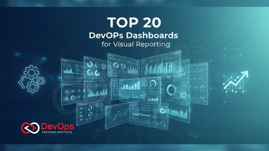
Top 20 DevOps Dashboards for Visual Reporting
Dive deep into the top 20 DevOps dashboards and visual reporting tools that are essential for achieving complete observability and data-driven continuous improvement. Learn how to centralize metrics from your entire software delivery pipeline, from code commits and CI/CD status to production health and business outcomes. This guide covers a wide spectrum of solutions, including robust open source platforms like Grafana, comprehensive full-stack observability suites such as Datadog and New Relic, and specialized tools tailored for DORA metrics. Mastering these visualization platforms is the key to transforming raw data into actionable insights for developers, operations engineers, and executive stakeholders alike.
Introduction The Power of Centralized DevOps Visibility
In the high-speed world of DevOps, visibility is not a luxury, but a fundamental necessity. Teams are constantly integrating new code, deploying changes to production, and maintaining complex microservices architectures across various environments, which generates an enormous amount of operational data. Without a centralized, well-designed dashboard, this data remains fragmented and unusable, making it nearly impossible to quickly identify bottlenecks, track service health, or understand the impact of technical decisions on business goals. A truly effective DevOps dashboard transforms this telemetry into actionable intelligence, accessible to everyone from the junior developer to the CEO.
A DevOps dashboard serves as the single pane of glass, correlating metrics from disparate tools across the entire value stream. It pulls data from source control systems, CI/CD pipelines, testing frameworks, application performance monitoring (APM) tools, and logging services. This aggregation allows teams to move beyond simply monitoring CPU and memory usage, enabling them to visualize crucial business and software delivery metrics, such as the DORA metrics: Deployment Frequency, Lead Time for Changes, Mean Time to Recovery (MTTR), and Change Failure Rate. These dashboards guide continuous improvement and foster the critical culture of transparency and shared responsibility that defines successful DevOps.
The choice of a dashboard tool is pivotal, as it must seamlessly integrate with the existing technology stack and provide the flexibility needed to create dashboards tailored to different audiences. For instance, developers need real-time data on build failures and code quality, while executives focus on delivery velocity and availability. The following list of 20 tools represents the best-in-class solutions for visual reporting, covering a spectrum of open source flexibility, full-stack commercial power, and platform-specific integration to provide comprehensive visibility across all facets of the DevOps lifecycle.
The Open Source Pillars of DevOps Dashboards
Open source tools form the backbone of observability for many organizations, offering unmatched flexibility and community support without the high licensing costs of commercial platforms. These tools are often highly specialized, requiring integration with other components to build a complete dashboard solution, but their power and customization capabilities are virtually limitless. They represent the original spirit of DevOps, allowing teams to build exactly the monitoring stack they need using widely adopted industry standards. Mastering these fundamental platforms is essential for any engineer working in the monitoring space.
These tools shine in their ability to handle high-volume, high-velocity time-series data and logs. They offer a powerful alternative to vendor lock-in, providing API access and a huge variety of community-contributed plugins and connectors for every conceivable data source. While they require more internal resources for maintenance, configuration, and scaling, the level of control and the ability to customize visualizations down to the pixel often makes them the preferred choice for large, technically sophisticated DevOps and Site Reliability Engineering (SRE) teams who prioritize ownership of their data stack.
- Grafana: Undisputed champion of visualization, Grafana connects to nearly every backend metric store (Prometheus, InfluxDB, Elasticsearch, etc.) to create highly interactive, shareable dashboards. Its alert manager and templating features are indispensable for standardized reporting and on-call response.
- Prometheus: Primarily a metrics collection and alerting tool, Prometheus uses its powerful PromQL query language to define and aggregate time-series metrics. While it is not a visualization tool itself, it is the most common data sources for Grafana dashboards in Kubernetes and microservices environments.
- Kibana (ELK/Elastic Stack): The visualization component of the popular Elastic Stack (Elasticsearch, Logstash, Kibana), it excels at creating dashboards for searching, analyzing, and visualizing log data. It provides powerful drill-down capabilities, making it excellent for security analysis and troubleshooting complex system performance issues.
- Zabbix: A comprehensive, all-in-one open source monitoring solution that collects metrics, performs alerting, and provides a powerful web interface for creating dashboards focused heavily on infrastructure and network performance. It is known for its agent-based monitoring capabilities.
- InfluxDB: A high-performance time-series database optimized for metrics collection from IOT and infrastructure. It forms the storage layer for dashboards, often paired with Grafana for visualization, specifically built to handle the unique data structures generated by modern application telemetry.
Full Stack Observability Platforms The Commercial Leaders
Commercial full-stack observability platforms consolidate metrics, logs, and traces into a single platform, eliminating the need to manage multiple open source tools and their complex integrations. These vendors offer unified dashboards right out of the box, with intelligent features like automated anomaly detection and guided root cause analysis powered by proprietary machine learning algorithms. Their strength is in their ease of use, rapid deployment, and the cohesive experience they offer across infrastructure, application, and end-user monitoring.
These platforms are particularly well-suited for organizations that prioritize fast time-to-value and reduced operational overhead. They typically leverage lightweight agents installed across the infrastructure to collect vast amounts of telemetry data automatically, which is then immediately available for visualization in customizable dashboards. While they come with a subscription cost, the integrated tracing and APM capabilities often justify the expense by providing a depth of insight into complex, distributed applications that is difficult to achieve with disparate open source tools.
- Datadog: A leading cloud-based monitoring and analytics platform that provides full-stack observability. Its dashboards are highly customizable and integrate metrics, logs, and application traces on a single screen, offering a powerful unified view of the entire technology stack, from code to end-user experience.
- New Relic: Offers a comprehensive observability platform that includes APM, infrastructure monitoring, and synthetic monitoring. New Relic dashboards are known for their clarity and ability to correlate application performance data with business transaction metrics, making them a favorite for product and engineering alignment.
- Dynatrace: An AI-powered observability platform that utilizes its proprietary Davis AI to automatically discover and map application dependencies and detect anomalies. Its dashboards provide automatic context and are highly intuitive, often showing not just what is happening, but why, which is crucial for reducing Mean Time to Resolution.
- AppDynamics (Cisco): Focused heavily on application performance monitoring and business transaction tracing. AppDynamics dashboards excel at mapping application architecture and visually tracking transactions across microservices, allowing teams to quickly identify performance bottlenecks tied directly to user experience.
- Splunk: Primarily known as a log management platform, Splunk’s Enterprise Security and Observability tools provide powerful dashboards for real-time analysis of large volumes of machine data. Its dashboards are complex but highly effective for security monitoring and deep operational analytics across all facets of the infrastructure.
Platform and Ecosystem Specific Dashboard Tools
Many development platforms and cloud providers now offer powerful native dashboarding capabilities that are tightly integrated with their ecosystem. These tools offer the best performance and easiest setup for teams already operating within a specific vendor environment, as they require minimal configuration to start pulling in relevant metrics directly from their source systems. The seamless integration often means that the dashboards automatically reflect the structure and health of the projects managed within the platform.
These dashboards typically focus on software delivery metrics and workflow efficiency. For example, a tool integrated with a source control system will naturally excel at visualizing pull request cycle times and commit volumes, while a CI/CD-specific tool will focus on build success rates and deployment frequency. While they might lack the deep infrastructure metrics of the full-stack APM tools, they provide the clearest and most immediate reporting on the core DevOps workflow metrics, which are essential for team productivity and flow system performance tracking.
- Azure DevOps Built-in Dashboards: Provides native, customizable dashboards to track work item status, test results, build success rates, and deployment metrics directly within the Azure DevOps portal. They are ideal for teams managing their entire delivery pipeline within Microsoft's ecosystem.
- GitLab: Offers powerful Value Stream Analytics dashboards and native CI/CD dashboards that track pipeline duration, cycle time, and other key DORA metrics, providing end-to-end visibility across the entire DevSecOps workflow without requiring external tools.
- GitHub Dashboards and Actions Reporting: Utilizes project boards and GitHub Actions reporting interfaces to visualize workflow status, build logs, and code review cycle times. While less focused on infrastructure, it provides excellent visibility into developer throughput and code quality processes.
- Jira Dashboards: While primarily an issue tracking tool, Jira’s powerful dashboarding feature allows teams to create visual reports based on Kanban or Scrum board metrics, tracking velocity, burndown, and issue flow through the development pipeline, providing an essential view of team workflow health.
- ServiceNow DevOps Insights: Specifically designed to monitor and report on the effectiveness of the DevOps toolchain, focusing on DORA metrics and providing dashboards that correlate service health, incident data, and change management processes into a single executive view.
DevOps Dashboard Tool Comparison Summary
Choosing the right dashboard tool depends heavily on the existing toolchain, the budget, and the specific metrics that matter most to the organization. This table summarizes the strengths of the different categories of dashboards, highlighting where each type excels in providing visual reporting and insight.
| Category | Key Tools Represented | Best For Visualizing | Primary Focus |
|---|---|---|---|
| Open Source Metrics & Viz | Grafana, Prometheus, InfluxDB | Infrastructure Metrics, Custom Time Series Data, High-Volume Logs | Customization and Cost Control |
| Full Stack Observability | Datadog, New Relic, Dynatrace | APM, Traces, Service Maps, Guided Root Cause Analysis | Ease of Use and Comprehensive Insights |
| Platform Native Tools | Azure DevOps, GitLab, GitHub | Build Success Rates, Deployment Frequency, PR Cycle Time | Workflow Efficiency and Delivery Flow |
| Business & ALM Focus | Jellyfish, Tableau, Power BI | DORA Metrics, Team Throughput, Business ROI, Financials | Executive Reporting and Strategic Alignment |
Advanced Reporting Tools for Strategic DevOps Insights
Beyond the core observability platforms, a specialized category of tools exists to aggregate data specifically for strategic reporting, often focusing on correlating engineering metrics with business value. These tools are crucial for executives and engineering leaders who need to understand the relationship between delivery speed, quality, and financial impact. They move beyond the "lights on" operational dashboards to focus on "value creation" dashboards, which is essential for proving the return on investment of a DevOps transformation.
These advanced tools often act as an aggregation layer, pulling pre-processed data from the monitoring and CI/CD tools already in use, such as Jenkins, Jira, and Datadog. They then apply proprietary algorithms to calculate complex metrics like team throughput, capacity planning, and the true cost of technical debt. By unifying data sources across the entire enterprise, they provide an unprecedented level of clarity on engineering effectiveness and efficiency, enabling truly data-driven decision-making at the highest levels of the organization.
- Jellyfish Engineering Management Platform: A purpose-built tool focused on measuring and visualizing engineering productivity and investment. It aggregates data to track DORA metrics, investment allocation (features vs. debt), and the true cost of software delivery across teams.
- Port.io (Internal Developer Portal): An emerging category of tool that unifies an organization's tooling into an Internal Developer Portal. It uses Scorecards and Dashboards to visualize health, compliance, and team metrics, offering context-rich reporting right in the developer's workspace.
- Tableau: A general-purpose business intelligence (BI) tool with extensive visualization capabilities. DevOps teams can use Tableau to ingest data from their monitoring tools, offering highly complex, custom, and interactive dashboards for deep dive analysis and executive reporting.
- Power BI: Microsoft’s BI solution, which integrates naturally with Azure DevOps and other Microsoft services. It allows for the creation of rich, interactive dashboards focused on correlating technical performance data with broader organizational metrics and financial reports.
- SquaredUp: A specialized dashboard platform that creates visually stunning, live dashboards from multiple sources like Azure DevOps, Prometheus, and ServiceNow. It is known for its ability to create powerful, contextual dashboards quickly for various audiences.
Niche and Complementary Dashboard Solutions
The remaining tools fill specialized niches or serve as essential complementary components within a larger dashboarding strategy. They are vital for providing visibility into specific layers of the architecture, such as virtualization environments, security posture, or specific cloud provider resources. A complete DevOps observability strategy often involves combining these niche tools with a central visualization platform like Grafana or a commercial APM suite.
The focus of these tools is typically on deep specialization. For instance, an APM tool will excel at visualizing code-level latency, while a cloud-native tool will provide the best view of resource utilization and cost. By leveraging these specialized dashboards, teams can ensure that no blind spots exist in their end-to-end visibility. This holistic approach ensures that potential incidents are caught across all layers of the stack, from the foundational operating system to the high-level business transaction layer, enabling rapid and precise issue resolution.
- Amazon CloudWatch: AWS's native monitoring and observability service. It provides highly integrated dashboards for tracking metrics and logs across all AWS resources, making it essential for teams operating on the AWS cloud platforms and wanting fast, native visibility into their infrastructure and application health.
- Google Cloud Operations (formerly Stackdriver): Google Cloud's integrated suite for monitoring, logging, and tracing. Its dashboards provide a unified view of Google Cloud resources and are built for the scale and complexity of cloud-native applications running on GCP and Kubernetes.
- ONES Project: A comprehensive project management tool that offers intuitive dashboards for tracking tasks, sprints, and team performance, similar to Jira but often with a stronger focus on end-to-end project visibility and progress reporting.
- Nagios: An open source tool focused on infrastructure and network monitoring. Its dashboards are functional and provide essential "up/down" status views and alerts for servers, services, and network devices, making it a foundational component for many older monitoring stacks.
- Sensu: A flexible monitoring event pipeline built for the cloud. Sensu’s dashboards aggregate data from its check execution agents, providing a robust view of service health and custom metrics in highly dynamic environments like Kubernetes and microservices.
Conclusion Driving Improvement with Visual Reporting
The proliferation of data generated by modern software delivery pipelines makes visual reporting not just a helpful feature, but a mandatory practice for high-performing DevOps organizations. The top 20 dashboards outlined here cover the full spectrum of needs, ranging from the technical granularity of open source tools like Grafana and Prometheus to the business-aligned strategic reporting offered by platforms like Jellyfish and Tableau. The most successful organizations understand that no single dashboard tool provides all the answers; instead, they implement a layered strategy, using specialized tools for collection and a primary visualization tool for aggregation and presentation.
By leveraging these powerful visualization platforms, DevOps teams can gain the deep, contextual insights required to track the four key DORA metrics, quickly pinpoint the source of incidents using visual correlation, and communicate the value of their engineering efforts to the wider business. The ability to translate complex technical metrics into clear, visual stories is the ultimate goal of the DevOps dashboard. This clarity ensures that every team member, from the engineer on-call to the product manager, is aligned on system health, delivery speed, and the ongoing pursuit of continuous improvement, solidifying the importance of dashboards as the central communication hub of the entire software organization.
Frequently Asked Questions
What is the difference between a dashboard and an observability tool?
An observability tool collects metrics, logs, and traces, while a dashboard is the visualization layer used to present and analyze that collected data.
What are the four key DORA metrics visualized on dashboards?
Deployment Frequency, Lead Time for Changes, Mean Time to Recovery (MTTR), and Change Failure Rate are the four core DORA metrics.
Why is Grafana so popular in DevOps?
Grafana is popular because it is an open source visualization platform that connects to almost every monitoring and data sources backend available.
What type of data does Kibana specialize in visualizing?
Kibana, as part of the ELK stack, specializes in visualizing and analyzing vast amounts of aggregated log data efficiently.
How do dashboards help with Mean Time to Recovery (MTTR)?
Dashboards correlate metrics across the stack, accelerating root cause analysis and reducing the time required to restore service after an incident.
What is the benefit of a full-stack observability platform like Datadog?
It provides a single, unified dashboard for metrics, logs, and traces, reducing tool sprawl and simplifying the monitoring stack.
Which dashboard is best for tracking developer throughput metrics?
Tools like GitLab or Jira provide excellent dashboards for visualizing software development metrics such as cycle time and task flow.
Why are custom dashboards often necessary for executives?
Executive dashboards focus on business value metrics like ROI, cost of errors, and financial impact, which differ from technical operational metrics.
How does Prometheus connect to Grafana?
Prometheus acts as the time-series database and metrics engine, while Grafana connects to it via an API to pull and visualize the data.
What does APM stand for in the context of dashboards?
APM stands for Application Performance Monitoring, which tracks and visualizes the health and speed of application code and user transactions.
What is the main challenge of using open source dashboard tools?
The main challenge is the increased internal effort required for maintenance, configuration, and managing scale compared to commercial tools.
What is the purpose of a dashboard in a CI/CD tool like Azure DevOps?
It visualizes the health of the pipeline, showing build success rates, deployment status, and overall delivery velocity over time.
What is the role of AI in modern DevOps dashboards?
AI helps by providing automated anomaly detection, correlating disparate events, and assisting in guided root cause analysis for faster resolution.
Can a business intelligence tool be used for DevOps reporting?
Yes, BI tools like Tableau and Power BI are excellent for complex, custom reports and for correlating technical data with business outcomes.
What metrics would an SRE team prioritize on their dashboard?
SREs prioritize operational metrics like latency, error rates, resource utilization, and key Service Level Indicators (SLIs).
What's Your Reaction?
 Like
0
Like
0
 Dislike
1
Dislike
1
 Love
0
Love
0
 Funny
0
Funny
0
 Angry
0
Angry
0
 Sad
0
Sad
0
 Wow
0
Wow
0


![100+ Azure DevOps Interview Questions and Answers [Updated 2025]](https://www.devopstraininginstitute.com/blog/uploads/images/202509/image_140x98_68c40aa9a3834.jpg)


![Future Scope of DevOps Careers in Pune [Updated 2025]](https://www.devopstraininginstitute.com/blog/uploads/images/202510/image_140x98_68e3a84652312.jpg)